An interesting approach to Photoshop post processing to create a faux ICM
Definitely worth a try.
Coloring outside the lines is a good metaphor for when a photographer decides to take a leap outside the norm in a photographic genre. It is possible you might face rebuttal from some members of the purist photography community when applying new ideas to your work in the genre, but there is too much creative potential left on the table to limit yourself to only playing by the
— Read on fstoppers.com/architecture/coloring-outside-lines-street-and-city-photography-609495
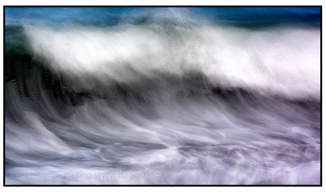
There is a balance in impressionist photography between the moment you remember and the precise instant of the photograph. My exploration has focussed on finding approaches that expand time to become that moment. Opacity Blend Image Stacking produces a result that comes close to that balance. This is what I do.
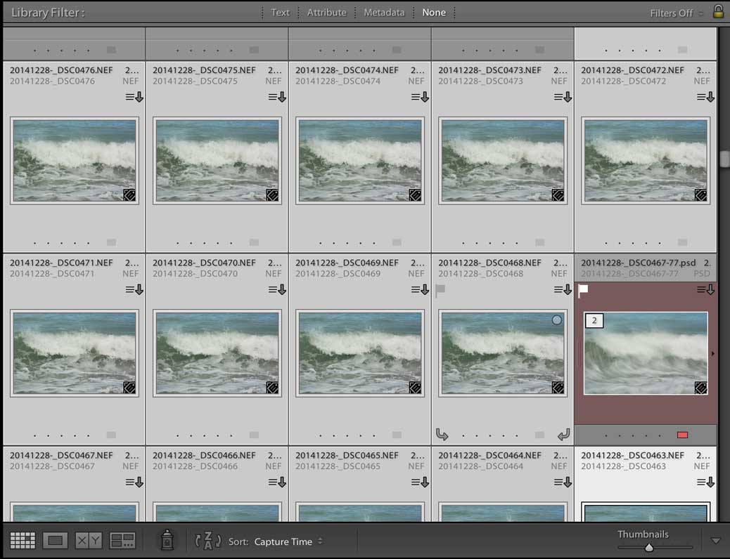
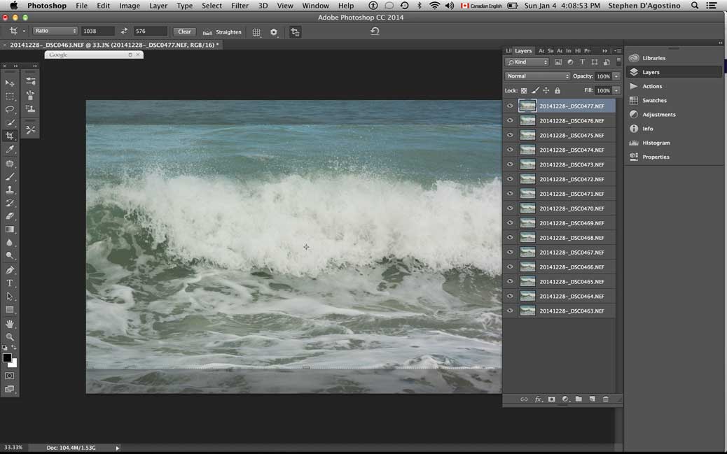
The images for this photo impressionistic wave were shot at 60 fps using Nikon’s N1 V3. I shoot hand held being careful to maintain a constant point on the subject even though the camera is panning. The images are then imported into Lightroom.
The images are then selected for the stack. The more images you use, the more impressionistic the effect.
In Photoshop the stack has to be blended to produce the base image. A good blend can be achieved by starting at the bottom of the stack and then reducing the opacity of the layer above it by about 50% until you reach 3-5%. Don’t be mechanistic with this step. Creativity with opacity significantly impacts on the finished result.
I merge the stack after balancing the opacity to produce a manageable file size. Note the blend results in a flat image. I address that later in my workflow.
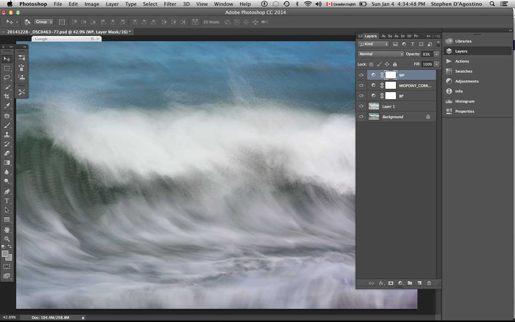
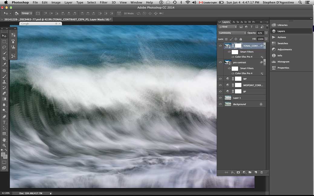
If I am going to use the Advanced Stacker App I run it here and then drag the layer over to my stacked image for blending. Note that the App is really just another opacity blend using the lighten mode. In doing so I find it often emphasises movement.
The process to this point has produced a flat lifeless image as a result the image averaging that has taken place. I add dimensionality to my photo impressionistic images using Nik’s Pro Contrast filter.
While many photographers crop at the beginning of their darkroom process to reduce the file size, I like to see what emerges and crop based on the results.
Over the years photography for me became much more than recording where I have been. Conveying the impression that the scene in front of me leaves on my mind became more important than a purely literal representation.
In my photographs I strive to capture the atmosphere and emotions that the surrounding world evokes in me, and hopefully pass on the feeling to the viewers. Photo impressionism is one of the techniques that allows to simplify the subject down to its essence, and reveal the sense that it creates. Similarly to when you glance at a scene without focusing on detail. The impression it leaves is that of colours, shapes and textures.
Therefore I dedicated a part of my work to experimenting with the intentional camera movement (ICM) and multiple exposure techniques commonly used in photo impressionism.
This image is a result of using these techniques. I was standing at the edge of a woodland, when I spotted the regular pattern created by the tree trunks, interspersed by the autumnal colours of the leaves on the forest floor. The colours were gradually merging into the darkness of the thick forest with no distracting highlights. A perfect combination of colours and shapes to paint with the camera.
I experimented with ICM, however I was not very happy with the results, which were simply streaks of colours. I wanted to preserve a little bit of texture in the leaves and tree trunks. Therefore I decided to use the double exposure functionality of my camera. The first exposure was a straight image with f5.6 aperture, focused on the trees closest to the camera. For the second exposure I chose a smaller aperture f16 to increase the shutter speed and to be able to capture the camera movement.
I post-processed the image in Adobe Lightroom 5, where I increased the contrast and clarity. I used the radial tool to darken the edges. Then I brought the image into Adobe Photoshop CS6 to further enhance the contrast and colours using the curves and NikSoftware ColorPro plugin.
The result is just enough detail to portray a late autumnal day in a forest, but without all the distractions that our minds tend to dwell on when observing the real world.
Editors Note: This is the first image of Vanda’s to catch my attention. I found it on Flickr where Vanda regularly exhibits her photo impressionistic vision. You can also find her on Facebook. Her website can be found at http://www.mylenscapes.co.uk/ Vanda’s work is definately worth checking out. Thanks for sharing your technique.
I am expanding the scope of the Photo Impressionism Project to include a discussion concerning photo impressionistic techniques. The project is called “The Lab” and am opening it up to all photo impressionists who are interested in sharing “how I did this”. The idea is to create a discussion; what works and what you might say… not so much.
Using long exposure, multiple exposure, digital stitching and photo stacking, photographers are going beyond the limits of photo-realistic, representative work. Photographers are demonstrating their imagination, inspiration, and interpretation in their efforts to move from realism to emotion and expression. Like the original impressionists painters, these photographers are incorporating movement as the fundamental and essential feature of the experience of the art. This art seems to transcend the literal and become the stuff of dreams, movement and imagination.
There are dozens of really talented photographers posting photo impressionistic images on photo sharing sites such as flickr and 500px. Here is a selection of images which that have been tagged “photo impressionism” sorted using flickrs’ interestinglyness algorithm or in the case of 500px, votes.
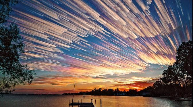
I really can’t get enough of Matt Molloy’s time stacked impressionistic images. Big blocks of colour and form with clouds reminiscent of Canadian impressionist painters Lawren Harris (The Old Stump) and Emily Carr (Above the Gravel Pit). And that is appropriate given Molloy’s roots in small town Ontario.
“My time stack photos are much like a modern version of impressionism. By combining multiple photos into one image, it shows how light and other elements change over time. This gives a unique sense of movement in an otherwise still image.”
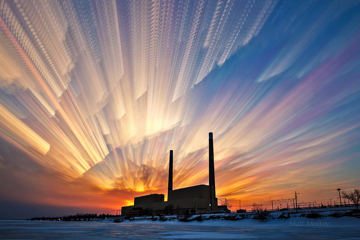
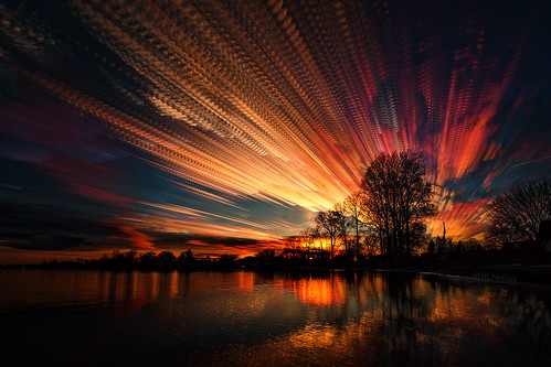
Power Plant by Matt Molloy: 263 photos merged into one image. “I wish I had set up a little earlier, so the lines made by the clouds went all the way to the horizon. I still like the way it turned out, I just hope the ice is sturdy enough for me to try this again.”
According to Molloy’s biography his artistic pursuits are multidisciplinary; music, painting, drawing and experimental time-lapse photography. I think you can see the influence of the painter in his work .
I really his Power Plant (above). The blocks of colour remind me of the northern lights and that contrast against the silhouette of the power plant with a hint of snow and ice is striking. If you look at the cloud blocks close to the horizon the colour is rich with nice smooth shapes drawing your eye and as your eye travels up the staccato effect trails off to the edge.
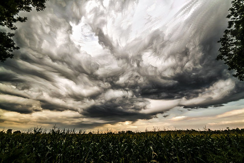
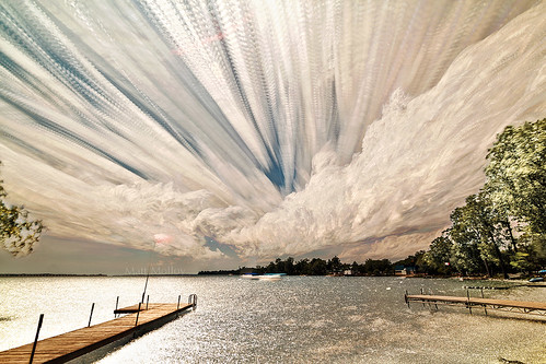
This is my personal favourite in his current portfolio. In two dimensions Molloy has been able to capture a moment in time we have all experienced; boiling clouds before a summer storm.
There is real drama close to the horizon. Again this in this image our eye moves to the top edge where the clouds start to lose their form as they bleed off the page.
Sky Sculptures by Matt Molloy. “This is an older timelapse. I’ve already done a photo stack with the photos, but this time I only used 75 of them. I like how some of the blue of the sky is still showing. In the other version it’s pretty much all clouds. http://www.flickr.com/photos/matt_molloy/7976402977/in/photostream”
Recently 500px featured a tutorial by Molloy describing this impressionistic technique. Basically he uses the “lighten” opacity blend mode to emphasize the light elements while leaving the darker unmoving elements untouched. You can find the tutorial at http://500px.com/blog/1051/tutorial-time-stack?page=1 . I am looking forward to trying it with some of my favourite subjects for photo impressionism.
“The exposure I’ve received through 500px has been great. I didn’t expect the “time stacking” tutorial to get so much feedback, but I’m glad it did. It’s brought me lots of new followers and likely got me some sales, so the hard work payed off.”
Twisted Sky by Matt Molloy. “90 photos merged into one image. I found this timelapse with some interesting cloud action while digging through old photos for my Tumblr page. matt-molloy.tumblr.com/ It’s really neat to see the clouds move like that, I think it’s the only time I’ve captured it on “film” Check out the timelapse video! http://www.youtube.com/watch?v=C4ij9wAG1BU”
What I find more interesting than the technique is its origins. Almost every photo impressionist I follow had a eureka moment; an idea spawned from something unrelated that compelled them to produce photo impressionistic images.
Molloy started his journey with time lapse time photography. The time tracking stacking technique has been used for years in astrophotography to produce star trails.
“Once I made a few star trail images, I wondered why I’ve never seen this technique used on daylight timelapses. I tried it and, after a little tweaking here and there, I was astounded by the resulting images! They are kind of like a super long exposure, showing a large chunk of time in a single image, which is very much like the Impressionist movement that some clever painters came up with around the year 1870.”
Its worth looking at the time lapse video Molloy produced to see the genius here. Time lapse compresses time into a few moments. Time stacking captures the moment by compressing time into a single frame. It’s an idea that I have struggled with for many years (see my artist’s statement for example).
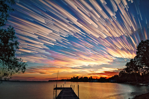
Twenty Minute Sunset by Matt Molloy. “313 photos merged into one image using the lighten layer-blending mode in photoshop. As the title implies, this was about 20 minutes of shooting. (at 4 second intervals) I was a little late shooting this timelapse, so it’s another one from my backyard. I’m lucky to live in such a photogenic area.”
I am always interested to know which images are an artist’s favourites. Molloy identified the following 3 and gave me his thoughts on why.
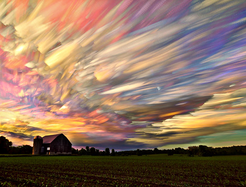
Sunset Spectrum by Matt Molloy “396 photos merged into one image using the lighten blending mode in photoshop. I think this one pretty much covers the colour spectrum of sunsets, lacking only the darker reds. I can’t get enough of this technique!”
Its hard not to fall in love with Sunset Spectrum; big colour, big sky, classic pastoral scene. To me this one feels like a crossover between the best elements of an impressionist painting and a traditional one. The contrast in styles is great here as it is in his other examples. Molloy told me that “Sunset Spectrum” is one of his favorite time stacks because “it has so many different colours in the sky. I think the barn and the field are a nice anchor for the image.”
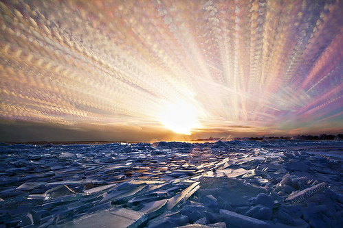
Icy Sunset “400 photos merged into one image using the lighten layer-blending mode in photoshop. Even though it was extremely cold and windy, it was worth going back here for a sunset timelapse. It was a good one! Luckily my tripod weight (a brick on a rope) kept my camera fairly steady, but it didn’t help with the water spraying into the air (from the waves crashing into the piles of ice) and onto my lens. The fact that I was shooting at f/11 didn’t help that either. (you can see a few spots near the center of the photo from water/ice on the lens catching the sunlight) Still happy with the way this turned out!”
Icy Sunset has some of the elements I like in Power Plant but here the jagged ice is a rough reflection of the staccato clouds above. for that reason I think it is a powerful image.
According to Molloy “Icy Sunset is one of my favorite time stacks because it shows clouds that were moving in different directions, but the thing I like most is the crazy foreground. Every year the ice breaks up and it often gets piled up along the shore, it’s always an amazing sight to see.”
Crocheting Clouds (below) is an explosion of colour. In many ways it best captures my memories of late August twilight in Muskoka. For a real treat let your eye wander through the reflections in the water.
“Crocheting the Clouds ” was selected by Molloy as a favorites “because of the rich colours of the clouds. It’s nice that they were reflected in the water too. I think the texture of the clouds is interesting and their paths seem to radiate from the big tree, which leads the eye nicely.”
Crocheting the Clouds by Matt Molloy. “186 photos of the sunset merged into one image using the lighten layer-blending mode in photoshop. I like the pattern in the clouds created from the interval between shots.”
I think Molloy is an artist to watch. My Modern Met interviewed Molloy last year and it is worth a read. You can see more of Molloy’s work of Flickr and 500px. He sells his work on FineArtAmerica.com. Or you can follow him on Twitter.
Sky Streams and Floating Mountains by Matt Molloy. “852 photos merged into one image using the lighten layer-blending mode. Two kinds of clouds moving and changing very differently.”
If you don’t follow David duChemin, you should. A great photographer with lots to say.
duChemin has just announced the release of an e-book focussed on abstract and photo impressionistic images. You can find the post at http://davidduchemin.com/2014/04/impressions-abstracts/ I am looking forward to reading it.
So why photo impressionism:
I had an experience with a painting – to say I merely looked at it wouldn’t do the moment justice – that made me wonder whether my own work created a similar experience in others, and if not – which is what I suspected – why not, and was there a way I could do that?
An interesting side bar; based on the file names, the images in the duChemin’s post are from his iphone.
Since writing this post duChemin has published The Visual Imagination. I hope to review it soon. Till then you can find it at:
Eastman’s portfolio focuses on slow shutter ICM images. They are really quite ethereal; almost painterly. The portfolio alone is worth the $8 magazine price.
Natural Dance- Hal Eastman
The portfolio is drawn from two recent collections. I prefer the “Natural Dance” images over his “Horse Rider” collection. The slow shutter adds to the mystery created by his use of natural locations. Because of the trees they have me thinking of Emily Carr although the subject matter is very different.
Its a busy time of year and easy to forget to pause and reflect on what is good and what matters – best wishes to all and thanks for your support of my photography projects photoimpressionism.ca/ and dagostino.ca/
The image is the Christmas Tree at Toronto City Hall shot in the round meaning about 40 images were captured all around the tree then merged together. The image is part of a series posted on Flickr at http://www.flickr.com/photos/photo-impressionism/